Friday 22 October 2010

Evaluation of Front Cover!

Evaluation

My task was to produce the front page of a new college magazine, featuring a photograph of a student in medium-close up range plus some appropriately laid out text and a masthead. Also I had to create a mock-up draft of the contents page. After researching other college magazines I was able to use them conventions in producing my front cover of a college magazine. I think I have produced a simple but effective college magazine cover.

The audience my magazine was aimed at was Wyke College students and I believe my front cover appeals to this audience. Students would be interested in reading my college magazine for information on all aspects college life from UCAS points to sports results. People planning to enrol at the college in the future could also read it, to get an insight into what’s going on in the college. I’d say the front cover is aimed at students interested in sports initially, but when they read on it appeals to a wide range of people and their interests.

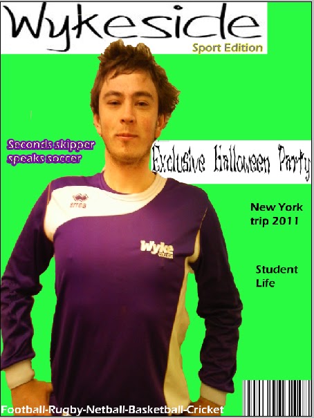
I believe my front cover meets the conventions of a college magazine in many ways. The masthead is eye-catching and specific to the college which is required in a masthead for a college magazine. I used the font Eras Light ICT for my masthead and sub-text as I think it’s a clear font and makes the cover look sleek. I chose the name ‘wykeside’ as I think it’s a sophisticated name and it represents the ins and outs of the college from a student point of view. I matched the magazine conventions in my research to my final design with the digital image covering the masthead slightly. I used a turquoise background for my cover because it symbolises happiness and relaxation which gives off a positive image on college life. For my digital image I used a medium shot of the second team football captain as I think he is a good role model for other students. I linked the image with a caption ‘seconds skipper speak soccer’ so the readers know what to expect when they read the magazine. I also added an outer glow effect and made the font purple to the sun-heading to make it different from the sub-text to show it’s the main discussion within the magazine.

The institution of the magazine cover was I as I constructed all of it. I also carried out the research of existing magazines so I could relate my work to those conventions. I think it also helped that I am already a student so I know what students want in a college magazine and I could adapt to these requirements.

I think my cover gives off a positive image on college life as it’s vibrant and quirky. The model on the cover is smiling slightly which represents humour and happiness which is a great aspect of being a Wyke college student.

I believe I could have improved my magazine cover by taking more digital images with a natural background on them, so they could show off some off the college a bit more. I also think I could have been a bit more creative in my production as it is quite a simple layout. All in all I believe my work has been a success as I planned well ahead of the deadline, giving me time to produce the cover.


hand drawn draft of front cover!


Add caption


hand drawn draft contents!

hand drawn draft of contents page

Final Magazine front cover!

Wednesday 20 October 2010

Plan of contents page!

Front cover draft!

This is an initial draft of my front cover of the college magazine. I am undecided about the background colour, and the headmast is an image so it is hard to get rid of the white background. This also occurs on the sub-text 'exclusive halloween party'. I like how the purple of the shirt contrasts with the green background. But the headmast is a problem so I might have to use a font from photoshop as it's easier to edit.

Tuesday 19 October 2010

Planning-Contents page ideas

  • Natalie's tips on surviving freshers year
  • Alex's lowdown on sport at the college(new sports being introduced)
  • Drama productions
  • The impressive new Oak building
  • Upcoming parties/events
  • New prospectus 2010-2011
  • Tips for exams and coursework
  • Trips-NYC/South Africa

Rough layout of front cover!

Monday 18 October 2010

Planning-Possible fonts

I like this font as it has a beach theme inside the text with the palm tree in the 'D'. I won't be using this font though because it doesn't look very clear, and I don't want my headmast in block capitals.

I like this font because it has kind of a hand-drawn look to it which would suggest that the magazine is produced by students. I won't be using the font because I want a more sleak and bold font.

I will be using this font acause I think it looks unique and clear. The font looks hand-drawn which I think will appeal to my target audience because it denotates a student has produced the magazine.

Thursday 14 October 2010

Digital photo's for front cover!

I won't use this image because I feel the quality of the image isn't great therefore it won't look very professional.


I am planning on using this image for my contents page as i'm going to do a page on 'Natalie's tips for surviving freshers year'

I may use this image for my contents page for a page on 'AJ speaks sport'


I am going to use this image for my front cover as it has the second team football captain is the wyke strip. This appeals to the audience with the wyke logo on the shirt.


Planning!

masthead- 'wyke weekly' 'wykeside'
colour- purple?(colour of the sports teams)   black and white image or very colourful and upbeat.
Audience- Wyke College students (16-19years) needs to be informative but not in loads of detail.
theme-sport
image on the front will give off a positive image of college life
image of a football teams captain(skipper speaks soccer)


 Sport at Wyke (football,rugby,netball) any new clubs coming up..volleyball!
Drama at Wyke(any performances coming up)
Student life
Upcoming events,Halloween party/Christmas Party/|New Year party?
 New prospectus for 2011/2012

Friday 8 October 2010

features of a college magazine

Main features.

Contents -
* What's on at the college - (pull-out monthly plan)
* Events outside the college
   - concerts, clubs, student nights etc
* Student deals / discounts / offers / vouchers
* News on past events
* Students voice - page dedicated to points students have brought up about college life.
e.g how it can be improved.
* Job vacancies


Front cover -
* Masthead - Bright, bold & colourful!
                   - Sans-serif
* Slo-go
* Coverlines
* Main image - student(s)
                     - casual / fun image
                     - based on main article
* Skyline
* Colour, colour and colour!

Tuesday 5 October 2010

LIIAR interpretation of the brief!

The Brief:


Preliminary exercise: using DTP and a image manipulation program, produce the front page of a new school/college magazine, featuring a photograph of a student in medium close-up plus some appropriately laid-out text and masthead. Additionally you must produce a mock-up of the layout of the contents page to demonstrate their grasp of DTP.

Audience
The audience of the magazine will be for Wyke College students, and it could also be for people interested in enrolling at the college in the future to get a feel for what college life is going to be like at Wyke. Students would read the magazine for information on any events coming up at the college. The magazine will need to follow the needs of Wyke students by being eye-catching.

Institution
The producer of the magazine cover and contents page will be myself. This will be ideal as I'm a student of the college so I know what students will want in a college magazine. I can also ask students what they think of the cover/contents page before submitting the work.

Language
Media terminology. For example, medium close-up and masthead. We will be using medium close-up shots on our magazine. I will attempt to make my magazine cover eye-catching and interesting. I will use a medium shot of the second team football captain as my digital image to portray my theme of sport at the college.

Ideology -
the opinions, beliefs and ways of thinking characteristic of a particular person, group, or nation.
  I'm hoping to promote a positive image of college in my magazine cover and contents page. I want students to take pride in the magazine as it's a product of the college and informs everyone at the college whats going on.


Representation - How things are portrayed to the target audience. Media texts are artificial versions of reality so I want my magazine to relate to actual college life as much as possible. I think this will be easy achievable.